
Code
ggplot(data = data_frame, aes(x = variable_1, y = variable_2)) +
geom_point()From basic charts to interactive graphics
Data visualization makes patterns, unusual observations, and relationships easier to identify than they are in a table alone. The ggplot2 package implements the Grammar of Graphics: a plot is assembled from data, aesthetic mappings, geometric objects, scales, and a theme.
This tutorial covers:
A basic ggplot needs three elements:
aes(), such as x, y, color, or fill.Scales, labels, facets, and themes can then refine the plot.
ggplot(data = data_frame, aes(x = variable_1, y = variable_2)) +
geom_point()R includes many named colors. Packages such as RColorBrewer provide coordinated palettes for categorical, sequential, and diverging data.
display.brewer.all()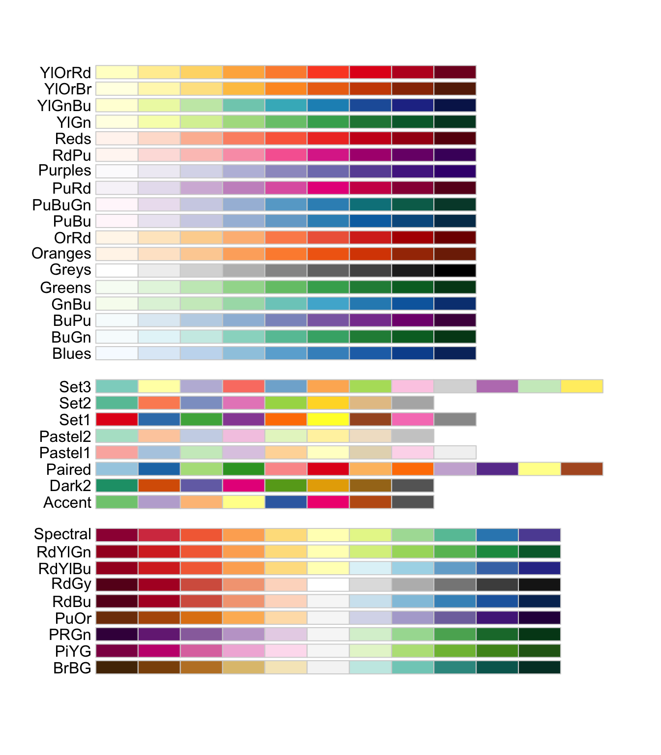
For more options, see the R color palette collection, including palettes designed with color-vision accessibility in mind.
The examples use surto.xlsx, a teaching dataset based on a foodborne illness investigation. In November 2018, 200 people attended a symposium. Of the 150 participants who ate lunch at the venue, 50 became ill. A case was defined as vomiting and/or diarrhea after eating at least one item served at the event.
The objective is to explore the participants, symptoms, laboratory measurements, and possible exposures through clear graphics.
outbreak <- readxl::read_excel("surto.xlsx", sheet = "Plan1") |>
  transmute(
    case = factor(caso, labels = c("No", "Yes")),
    sex = factor(sexo, labels = c("Female", "Male")),
    occupation = factor(
      ocupa,
      levels = c("enfermeiro", "estudante", "medico", "professor", "tecnico"),
      labels = c("Nurse", "Student", "Physician", "Professor", "Technician")
    ),
    severity = factor(
      gravidade,
      ordered = TRUE,
      labels = c("Mild", "Moderate", "Severe")
    ),
    drank_water = factor(agua, labels = c("No", "Yes")),
    hemoglobin = hb,
    leukocytes = leuco,
    triglycerides = tgl
  )

dplyr::glimpse(outbreak)
Rows: 150
Columns: 8
$ case <fct> Yes, Yes, Yes, Yes, Yes, Yes, Yes, Yes, Yes, Yes, Yes, Y…
$ sex <fct> Male, Female, Male, Male, Male, Female, Female, Male, Ma…
$ occupation <fct> Professor, Nurse, Professor, Professor, Student, Technic…
$ severity <ord> Mild, Mild, Moderate, Mild, Mild, Moderate, Severe, Mild…
$ drank_water <fct> Yes, Yes, No, No, Yes, Yes, No, Yes, No, Yes, Yes, Yes, …
$ hemoglobin <dbl> 11.61, 18.79, 10.00, 12.98, 14.62, 12.79, 14.24, 16.14, …
$ leukocytes <dbl> 11535, 13971, 13908, 10491, 13116, 12796, 17563, 14012, …
$ triglycerides <dbl> 194, 188, 97, 91, 101, 100, 102, 105, 89, 99, 101, 104, …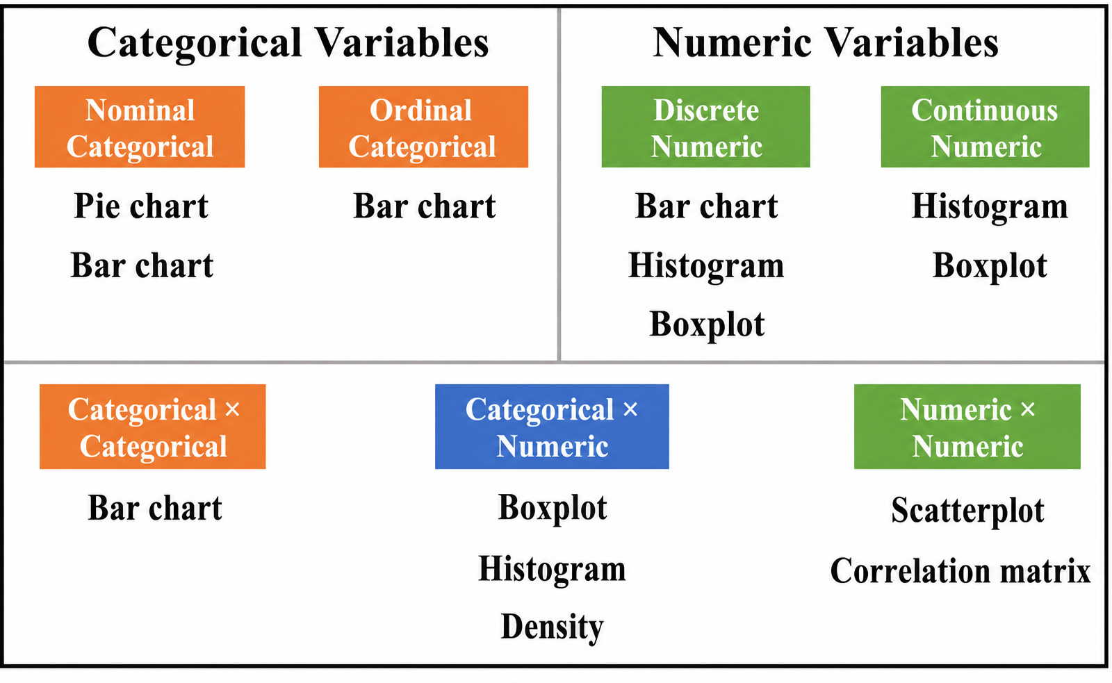
Bar charts display counts or proportions for categorical variables.
# A minimal count plot
ggplot(outbreak, aes(x = occupation)) +
  geom_bar()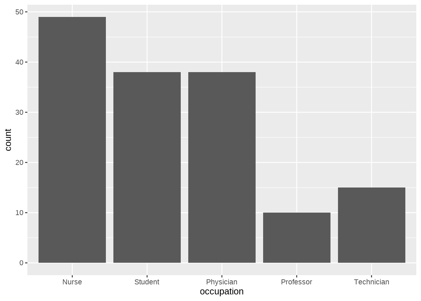
# A styled count plot
ggplot(outbreak, aes(x = occupation, fill = occupation)) +
  geom_bar(show.legend = FALSE) +
  scale_fill_brewer(palette = "Set1") +
  labs(
    title = "Participants by occupation",
    x = "Occupation",
    y = "Count"
  ) +
  theme_minimal()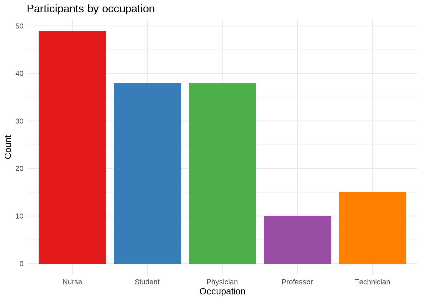
# Relative frequencies
ggplot(outbreak, aes(x = occupation)) +
  geom_bar(aes(y = after_stat(count / sum(count))), fill = "steelblue") +
  scale_y_continuous(labels = scales::percent) +
  labs(
    title = "Distribution of occupations",
    x = "Occupation",
    y = "Percentage"
  ) +
  theme_minimal()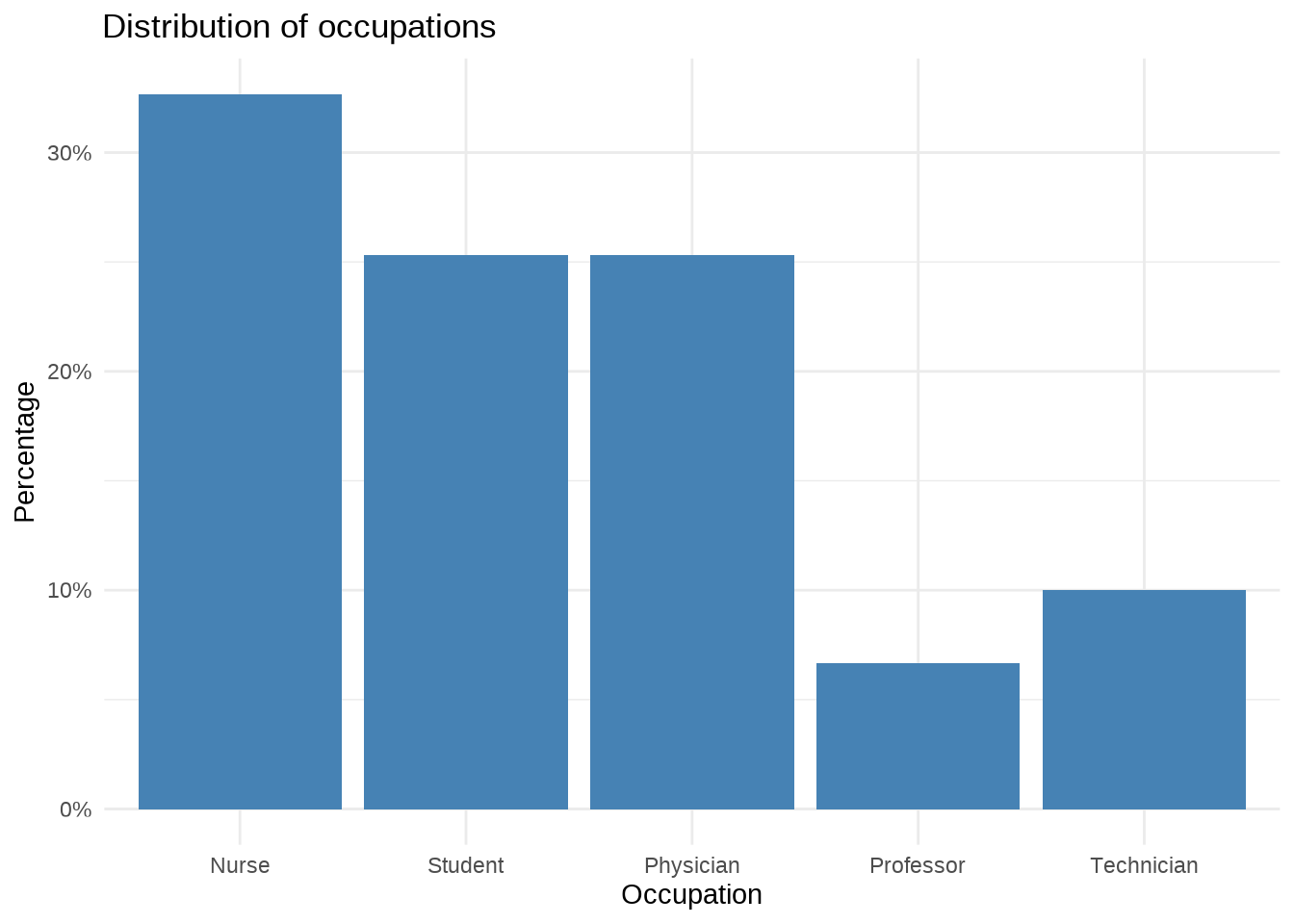
ggplot(outbreak, aes(x = occupation, fill = sex)) +
  geom_bar(position = "fill") +
  scale_y_continuous(labels = scales::percent) +
  scale_fill_brewer(palette = "Set1") +
  labs(
    title = "Sex distribution within occupations",
    x = "Occupation",
    y = "Percentage",
    fill = "Sex"
  ) +
  theme_minimal()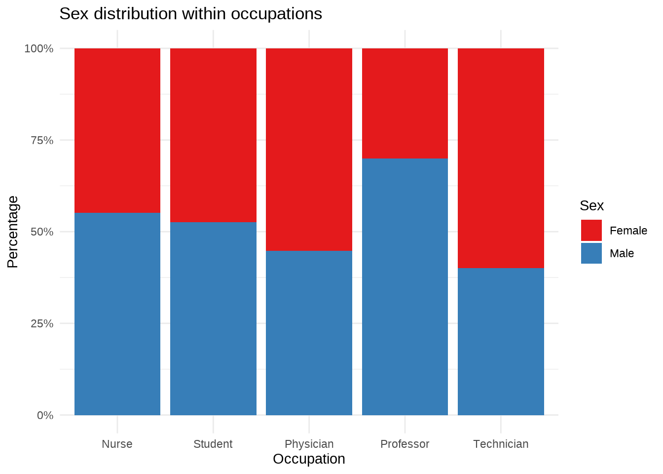
ggplot(outbreak, aes(x = case, fill = drank_water)) +
  geom_bar(position = "fill") +
  facet_wrap(~sex) +
  scale_y_continuous(labels = scales::percent) +
  scale_fill_manual(values = c("cornflowerblue", "dodgerblue4")) +
  labs(
    title = "Foodborne illness and water consumption",
    subtitle = "Results are shown separately by sex",
    x = "Foodborne illness case",
    y = "Percentage",
    fill = "Drank water?"
  ) +
  theme_bw()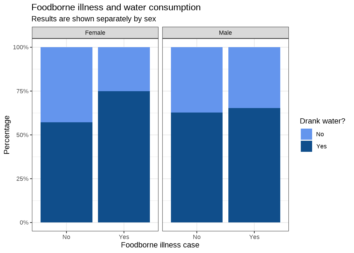
Pie charts use angle and area, which are harder to compare precisely than aligned bars. Use them sparingly and only when the number of categories is small.
ggplot(outbreak, aes(x = "", fill = case)) +
  geom_bar(width = 1) +
  coord_polar(theta = "y") +
  scale_fill_brewer(palette = "Set1") +
  labs(
    title = "Foodborne illness cases",
    x = NULL,
    y = NULL,
    fill = "Case"
  ) +
  theme_void()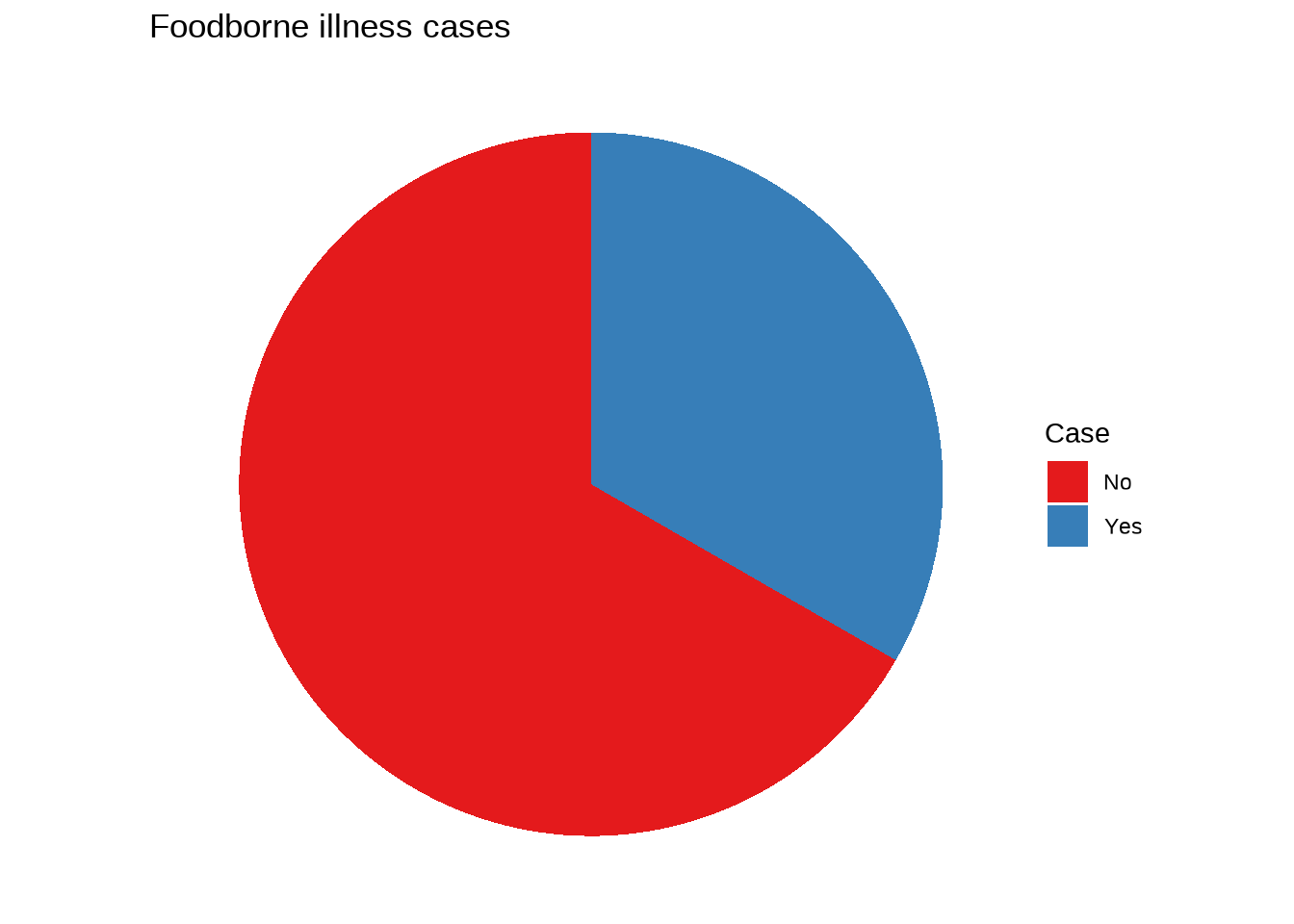
Histograms divide a continuous variable into bins. The bin width can strongly affect the apparent shape, so examine more than one reasonable value.
ggplot(outbreak, aes(x = hemoglobin)) +
  geom_histogram(bins = 40, fill = "midnightblue", color = "white") +
  labs(
    title = "Distribution of hemoglobin",
    x = "Hemoglobin (g/dL)",
    y = "Count"
  ) +
  theme_minimal()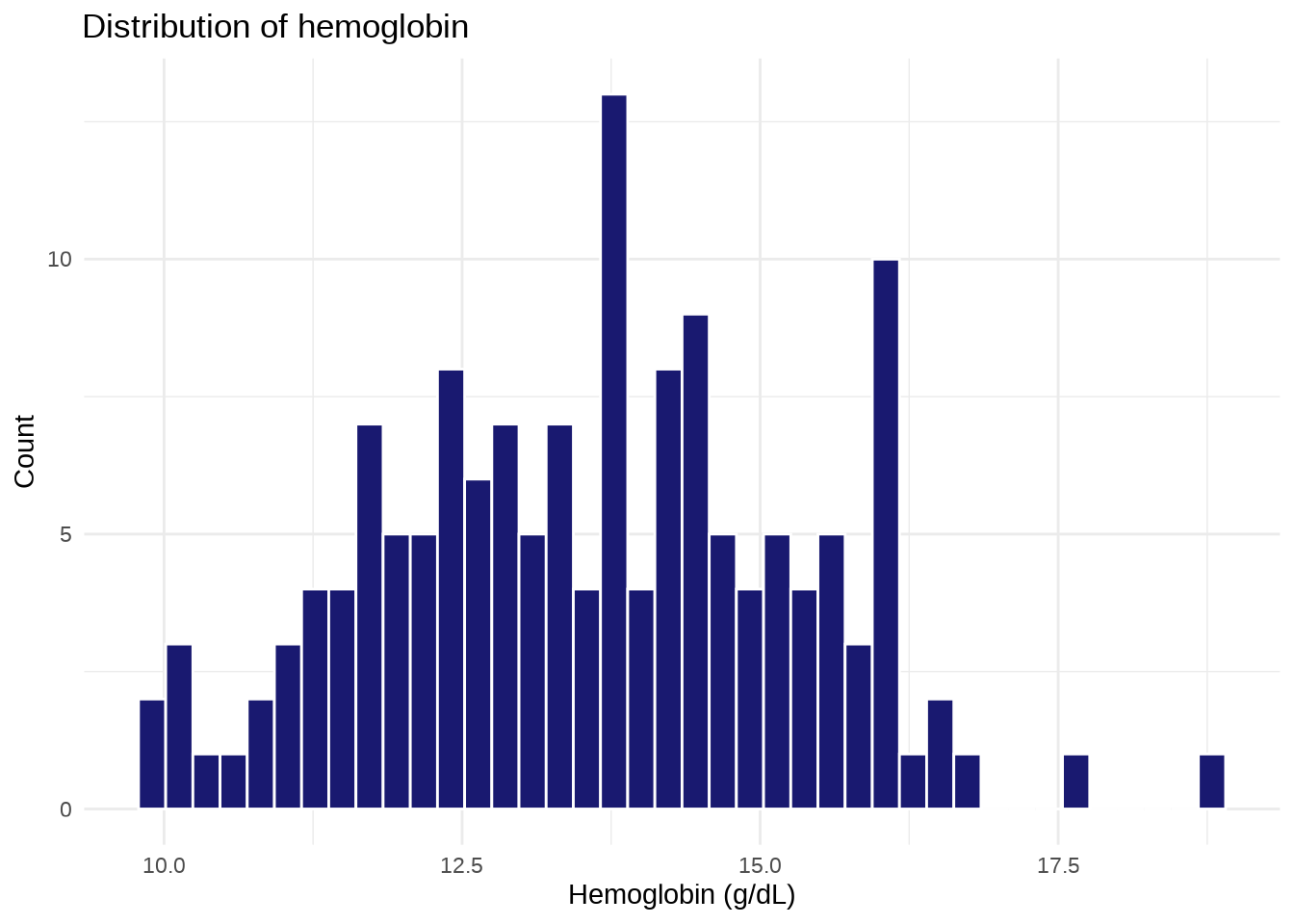
ggplot(outbreak, aes(x = hemoglobin, fill = sex)) +
  geom_histogram(bins = 40, color = "white", alpha = 0.75) +
  scale_fill_brewer(palette = "Set1") +
  labs(
    title = "Hemoglobin distribution by sex",
    x = "Hemoglobin (g/dL)",
    y = "Count",
    fill = "Sex"
  ) +
  theme_minimal()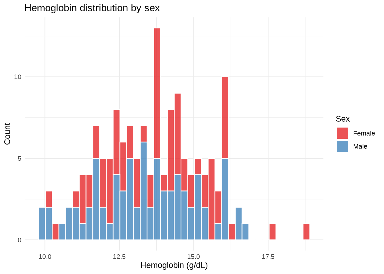
ggplot(outbreak, aes(x = hemoglobin, fill = sex)) +
  geom_histogram(bins = 30, color = "white") +
  facet_wrap(~case) +
  scale_fill_brewer(palette = "Set1") +
  labs(
    title = "Hemoglobin by sex and case status",
    x = "Hemoglobin (g/dL)",
    y = "Count",
    fill = "Sex"
  ) +
  theme_bw()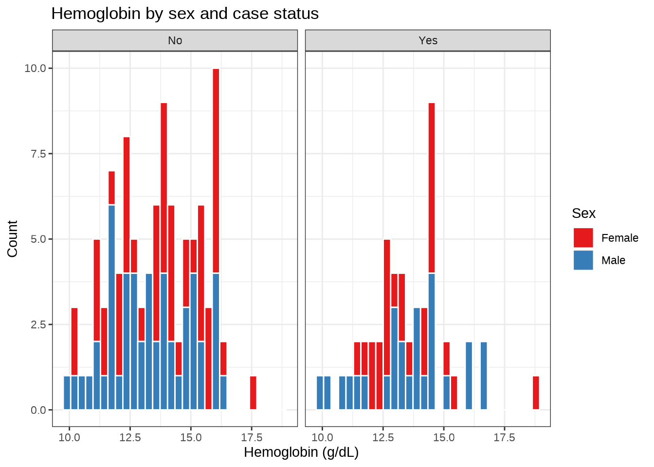
Boxplots summarize a continuous distribution through its median, quartiles, spread, and potential outliers.
ggplot(outbreak, aes(y = leukocytes)) +
  geom_boxplot(fill = "lightgreen", color = "darkgreen") +
  labs(
    title = "Distribution of leukocyte counts",
    x = NULL,
    y = "Leukocytes (µL)"
  ) +
  theme_minimal()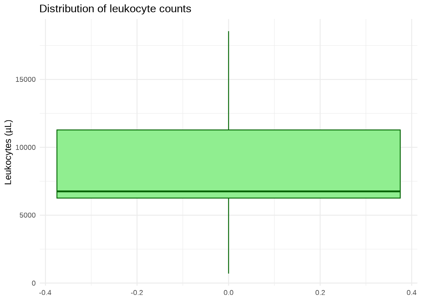
ggplot(outbreak, aes(x = occupation, y = leukocytes, color = occupation)) +
  geom_boxplot(show.legend = FALSE) +
  scale_color_brewer(palette = "Set1") +
  labs(
    title = "Leukocyte counts by occupation",
    x = "Occupation",
    y = "Leukocytes (µL)"
  ) +
  theme_minimal()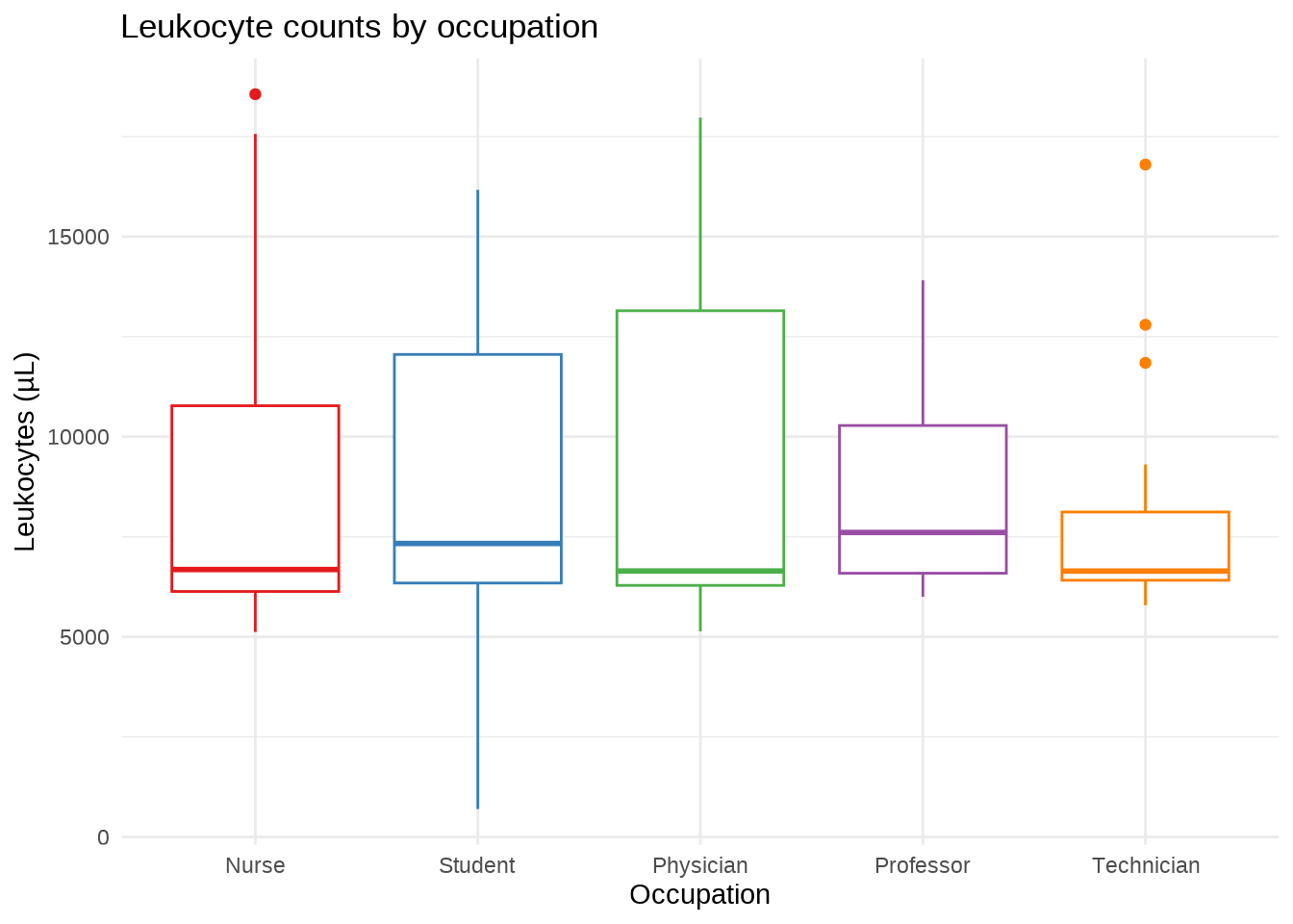
ggplot(outbreak, aes(x = case, y = leukocytes, color = case)) +
  geom_boxplot(show.legend = FALSE) +
  facet_wrap(~occupation) +
  scale_color_brewer(palette = "Set1") +
  labs(
    title = "Leukocyte counts by case status and occupation",
    x = "Foodborne illness case",
    y = "Leukocytes (µL)"
  ) +
  theme_bw()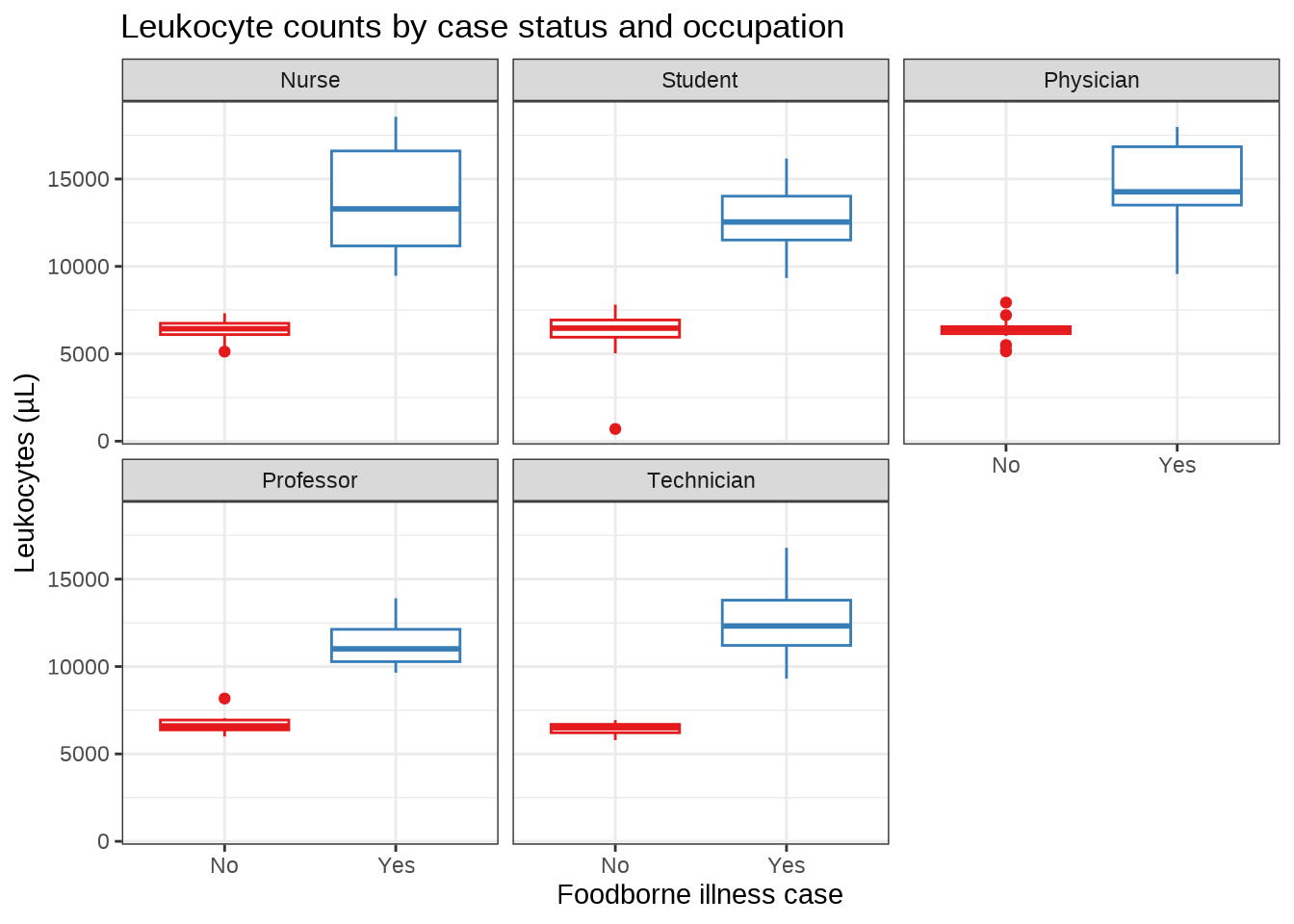
Density plots estimate a smooth distribution. They are useful for comparing shapes, but the smoothing bandwidth should be chosen carefully.
ggplot(outbreak, aes(x = hemoglobin)) +
  geom_density(fill = "firebrick3", color = "white", alpha = 0.8) +
  geom_vline(
    xintercept = mean(outbreak$hemoglobin, na.rm = TRUE),
    color = "black",
    linetype = "dashed"
  ) +
  labs(
    title = "Density of hemoglobin values",
    x = "Hemoglobin (g/dL)",
    y = "Density"
  ) +
  theme_minimal()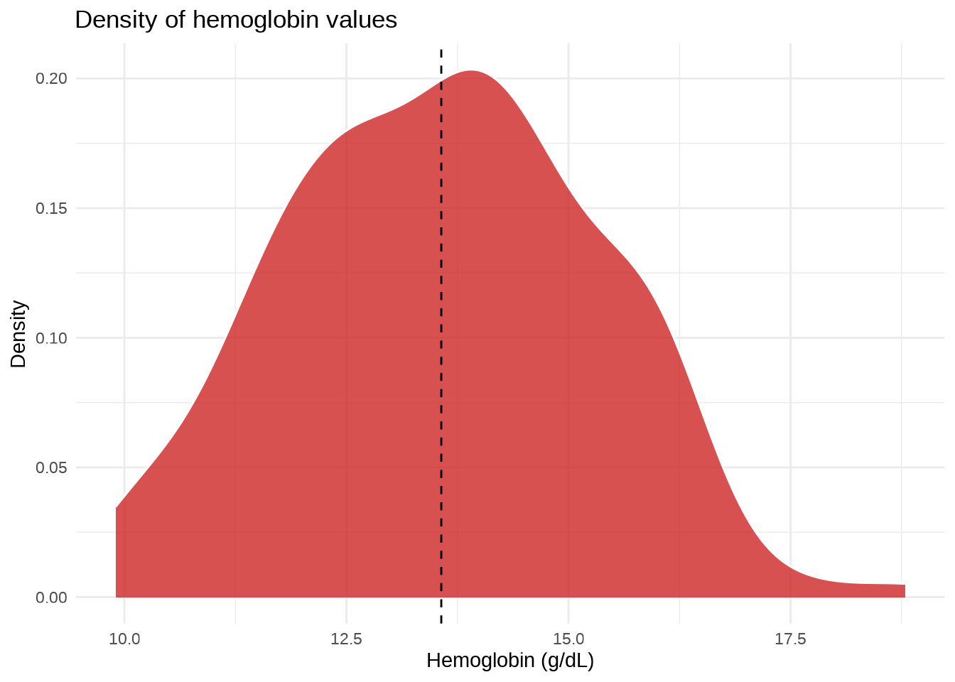
ggplot(outbreak, aes(x = hemoglobin, fill = case)) +
  geom_density(color = "white", alpha = 0.5) +
  scale_fill_brewer(palette = "Set1") +
  labs(
    title = "Hemoglobin density by case status",
    x = "Hemoglobin (g/dL)",
    y = "Density",
    fill = "Case"
  ) +
  theme_minimal()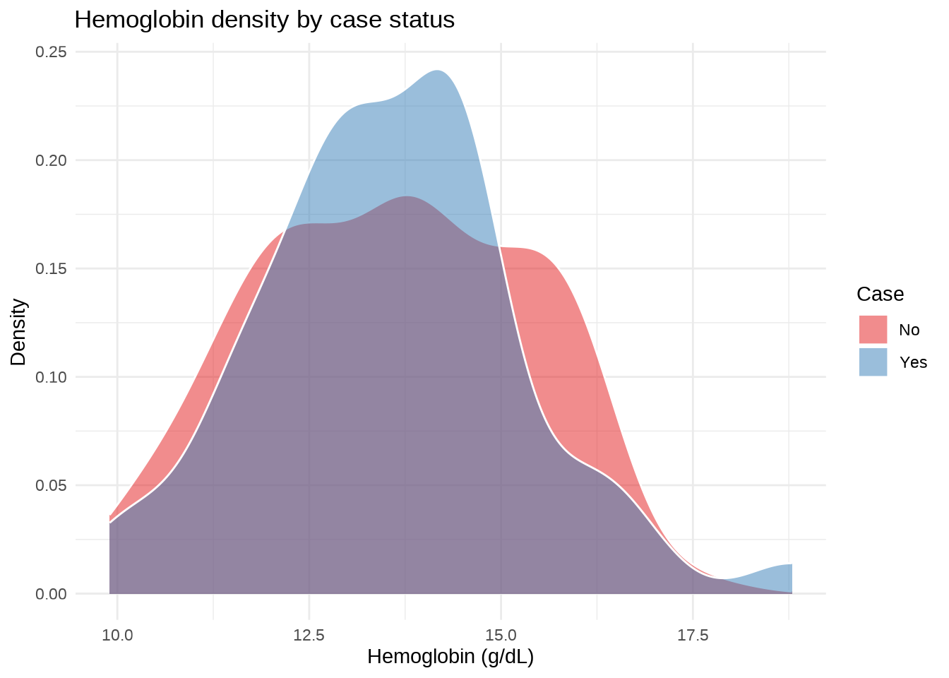
ggplot(outbreak, aes(x = hemoglobin, fill = case)) +
  geom_density(color = "white", alpha = 0.5) +
  facet_wrap(~sex) +
  scale_fill_brewer(palette = "Set1") +
  labs(
    title = "Hemoglobin density by case status and sex",
    x = "Hemoglobin (g/dL)",
    y = "Density",
    fill = "Case"
  ) +
  theme_bw()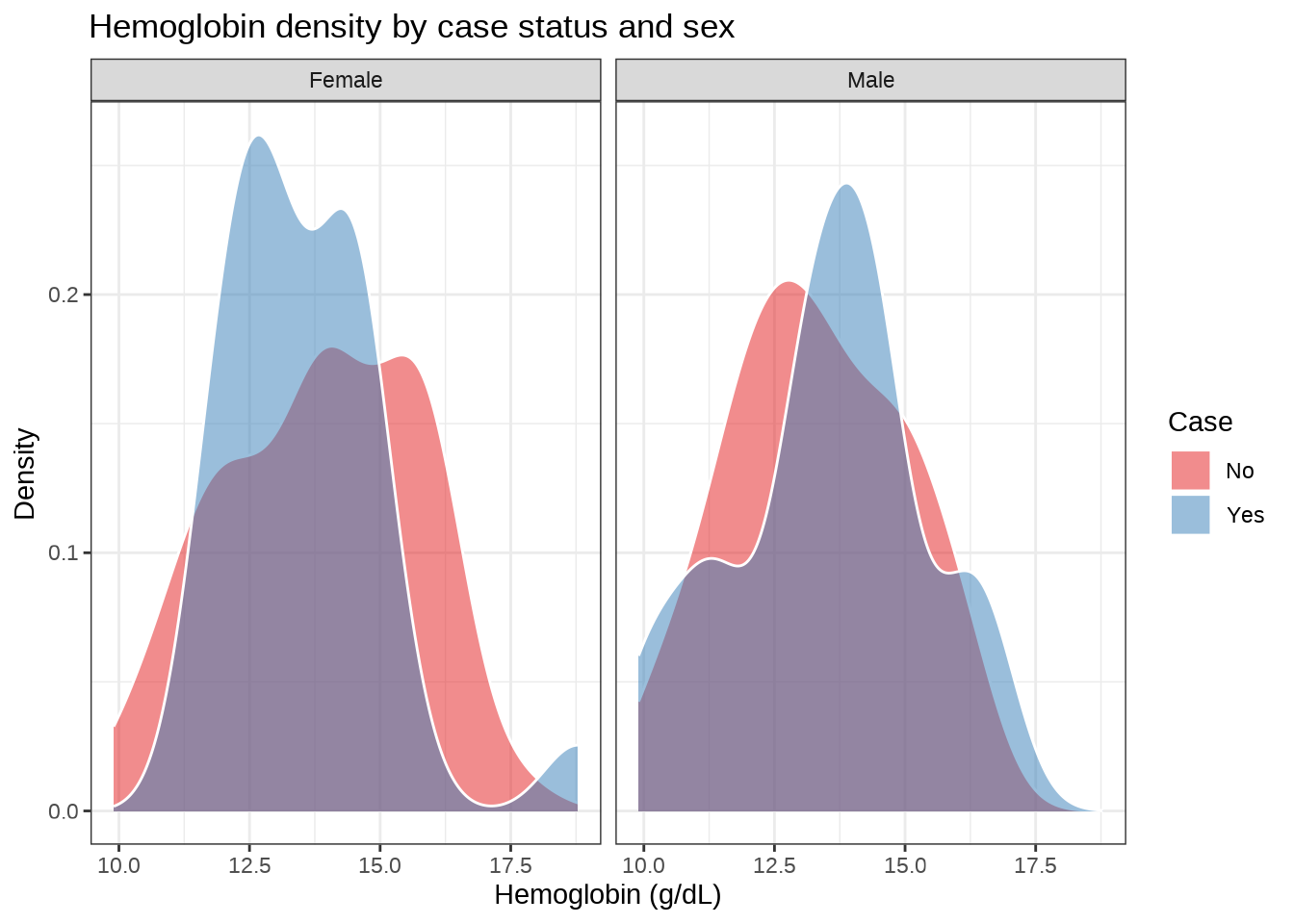
Scatterplots show the relationship between two continuous variables. Color, shape, or facets can add a third variable.
ggplot(outbreak, aes(x = hemoglobin, y = leukocytes)) +
  geom_point(color = "cyan4") +
  geom_smooth(method = "lm", se = FALSE, color = "dodgerblue4") +
  labs(
    title = "Hemoglobin and leukocyte counts",
    x = "Hemoglobin (g/dL)",
    y = "Leukocytes (µL)"
  ) +
  theme_minimal()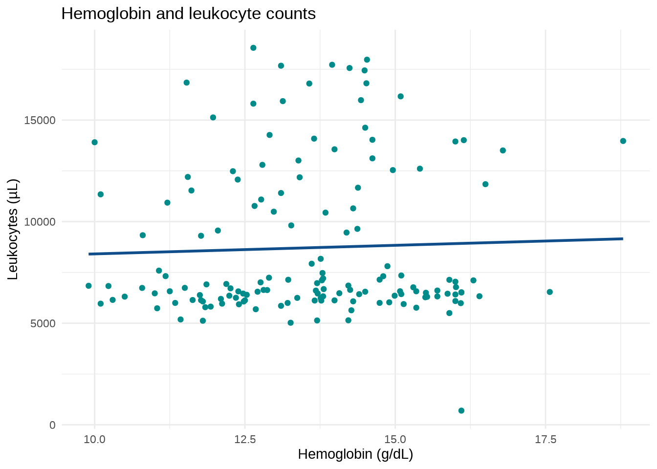
ggplot(outbreak, aes(x = hemoglobin, y = leukocytes, color = sex)) +
  geom_point() +
  geom_smooth(method = "lm", se = FALSE) +
  scale_color_manual(values = c("dodgerblue4", "darkgoldenrod2")) +
  labs(
    title = "Hemoglobin and leukocyte counts by sex",
    x = "Hemoglobin (g/dL)",
    y = "Leukocytes (µL)",
    color = "Sex"
  ) +
  theme_minimal()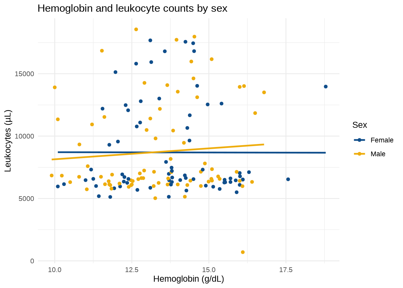
# Calculate Pearson correlations and p-values for numeric variables.
correlation <- Hmisc::rcorr(
  as.matrix(outbreak[c("hemoglobin", "leukocytes", "triglycerides")]),
  type = "pearson"
)
correlation$P[is.na(correlation$P)] <- 0

ggcorrplot::ggcorrplot(
  correlation$r,
  lab = TRUE,
  lab_size = 5,
  digits = 2,
  colors = c("blueviolet", "white", "firebrick"),
  legend.title = "Pearson\ncorrelation",
  p.mat = correlation$P
) +
  labs(title = "Correlation matrix", subtitle = "Pearson correlations")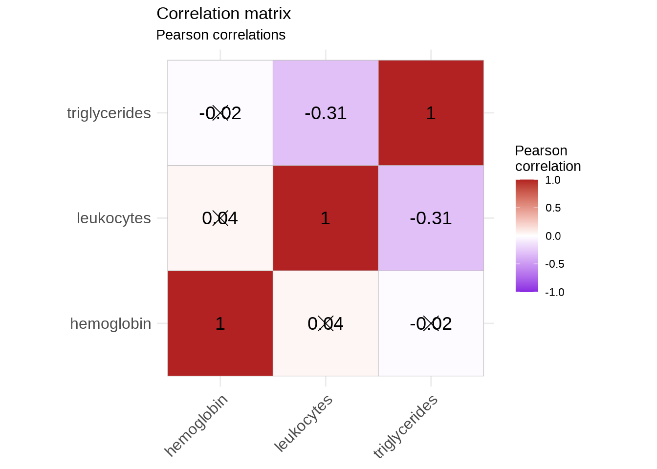
case_means <- outbreak |>
  group_by(case) |>
  summarise(mean_leukocytes = mean(leukocytes, na.rm = TRUE), .groups = "drop")

ggplot(outbreak, aes(x = leukocytes, fill = case)) +
  geom_histogram(
    aes(y = after_stat(density)),
    alpha = 0.45,
    position = "identity",
    color = "black"
  ) +
  geom_density(alpha = 0.25) +
  geom_vline(
    data = case_means,
    aes(xintercept = mean_leukocytes, color = case),
    linetype = "dashed",
    show.legend = FALSE
  ) +
  scale_fill_brewer(palette = "Set1") +
  labs(
    title = "Leukocyte distributions by case status",
    x = "Leukocytes (µL)",
    y = "Density",
    fill = "Case"
  ) +
  theme_minimal()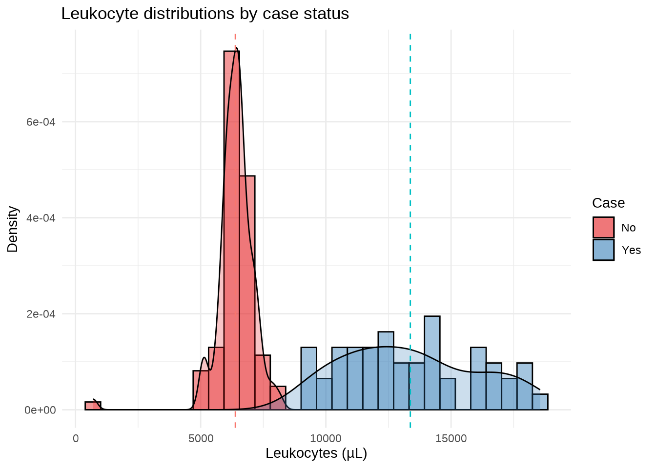
A raincloud plot combines a density estimate, a boxplot, and individual observations.
outbreak |>
  filter(case == "Yes", !is.na(severity)) |>
  ggplot(aes(x = severity, y = leukocytes, color = severity)) +
  ggdist::stat_halfeye(
    aes(fill = severity),
    alpha = 0.4,
    show.legend = FALSE,
    adjust = 0.5,
    width = 0.6,
    .width = 0,
    justification = -0.3
  ) +
  geom_boxplot(width = 0.25) +
  geom_jitter(alpha = 0.6, width = 0.1) +
  scale_color_brewer(palette = "Set1") +
  scale_fill_brewer(palette = "Set1") +
  labs(
    title = "Leukocyte counts by illness severity",
    x = "Severity",
    y = "Leukocytes (µL)",
    color = "Severity"
  ) +
  theme_minimal()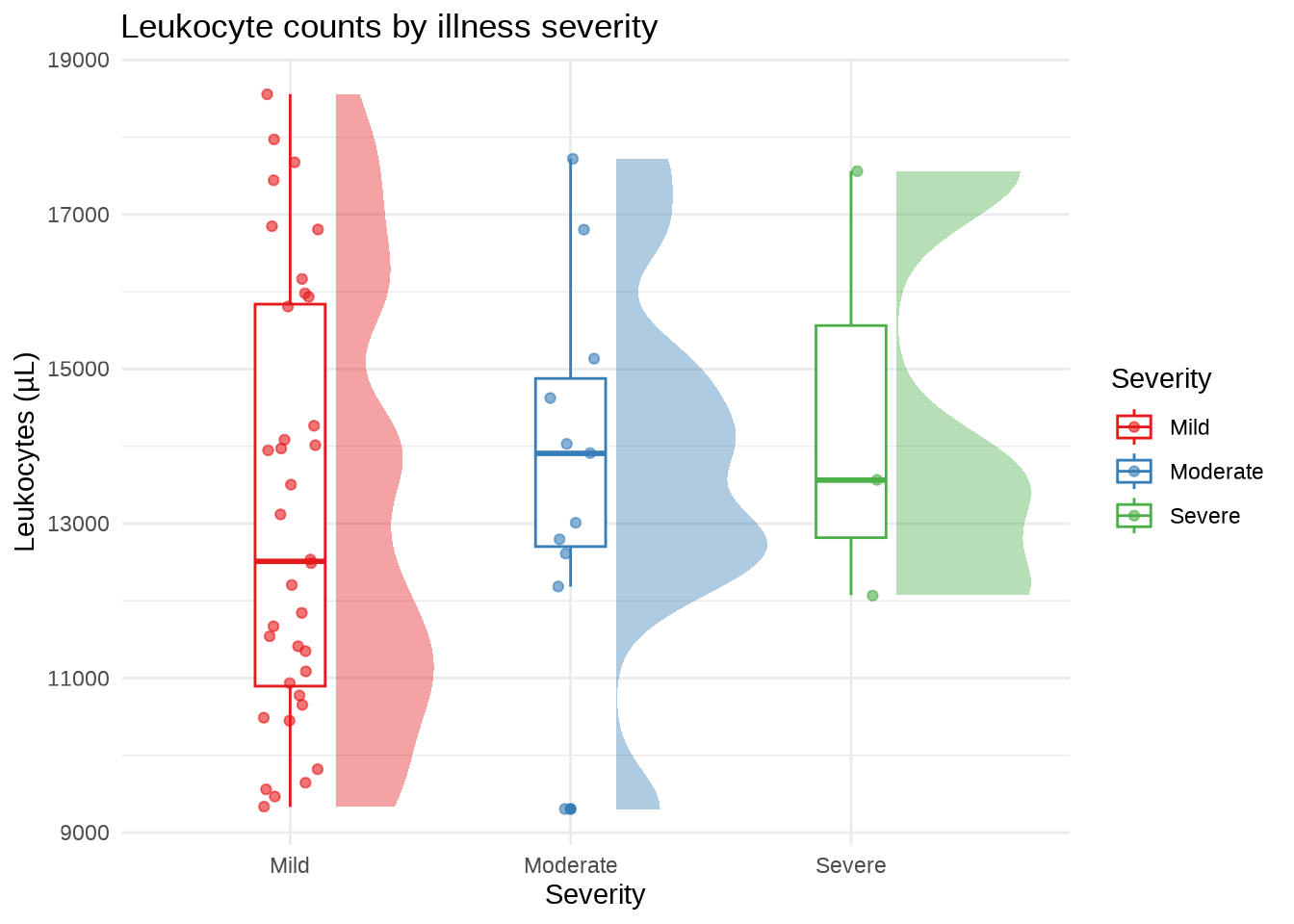
ggplotly() converts a ggplot into an interactive graphic with tooltips, zooming, and panning. Some styling may change during conversion.
interactive_boxplot <- ggplot(
  outbreak,
  aes(x = occupation, y = leukocytes, color = occupation)
) +
  geom_boxplot(show.legend = FALSE) +
  scale_color_brewer(palette = "Set1") +
  labs(
    title = "Leukocyte counts by occupation",
    x = "Occupation",
    y = "Leukocytes (µL)"
  ) +
  theme_minimal()

plotly::ggplotly(interactive_boxplot)interactive_scatterplot <- ggplot(
outbreak,
aes(x = hemoglobin, y = leukocytes, color = sex)
) +
geom_point() +
geom_smooth(method = "lm", se = FALSE) +
scale_color_manual(values = c("dodgerblue4", "darkgoldenrod2")) +
labs(
title = "Hemoglobin and leukocyte counts by sex",
x = "Hemoglobin (g/dL)",
y = "Leukocytes (µL)",
color = "Sex"
) +
theme_minimal()
plotly::ggplotly(interactive_scatterplot)